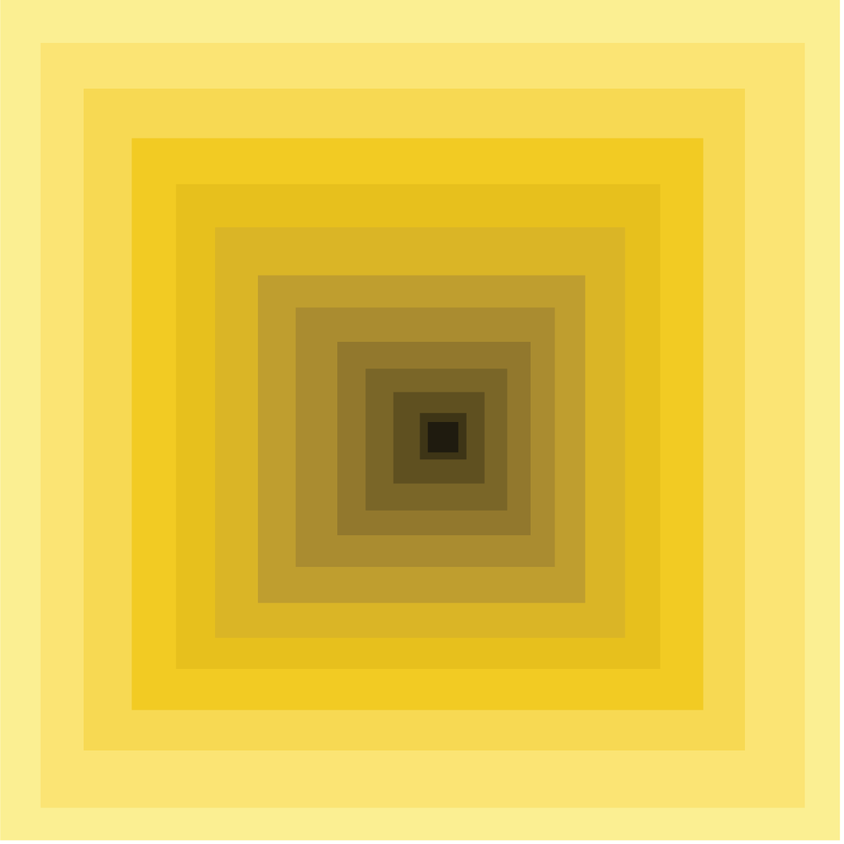
This project is more of a recent project, Taking different shades of yellow to make a focus towards the center of the design, starting from the lightest yellow, and as the design moves more towards the center the color gets darker and darker. Creating and takes the vision of the viewer towards the center of the design.
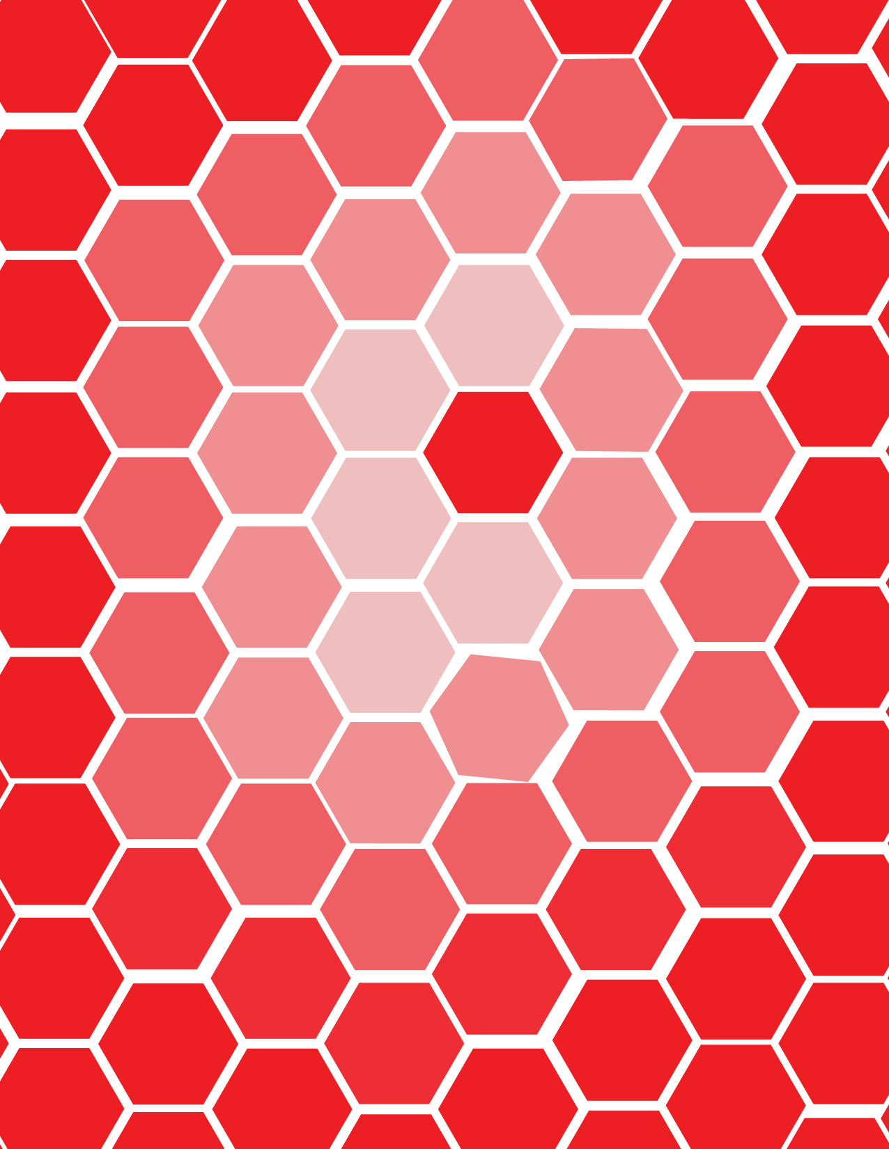
Similar to the last design this was done at the same period, taking a similar aspect but this time using a different saturation taking a color of choice, and create a design base of the saturation change using only a single shape of various sizes and colors the design utilizes gradations in saturation while retaining a fixed hue.
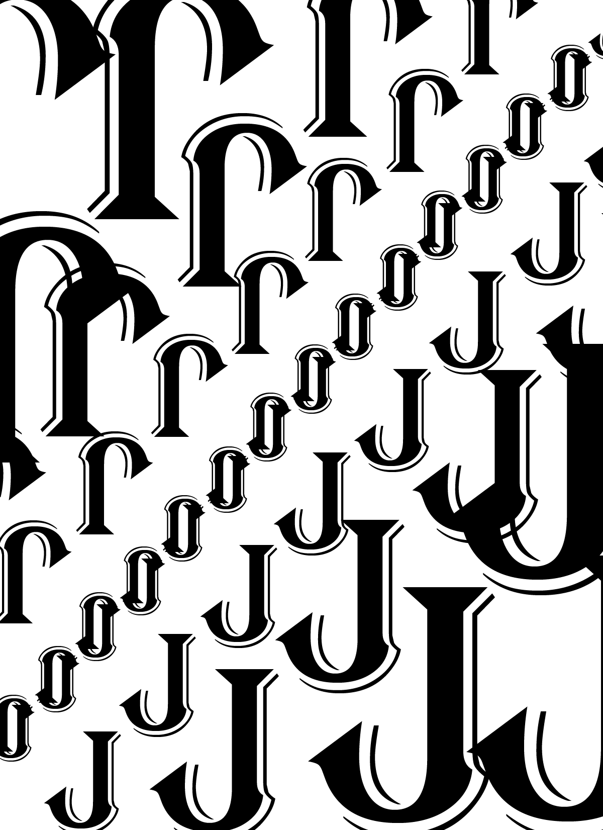
The theme for this project is texture and depth. Using only black and white and a single letter to create the vision of depth and getting the viewer's attention to the middle point of the design.
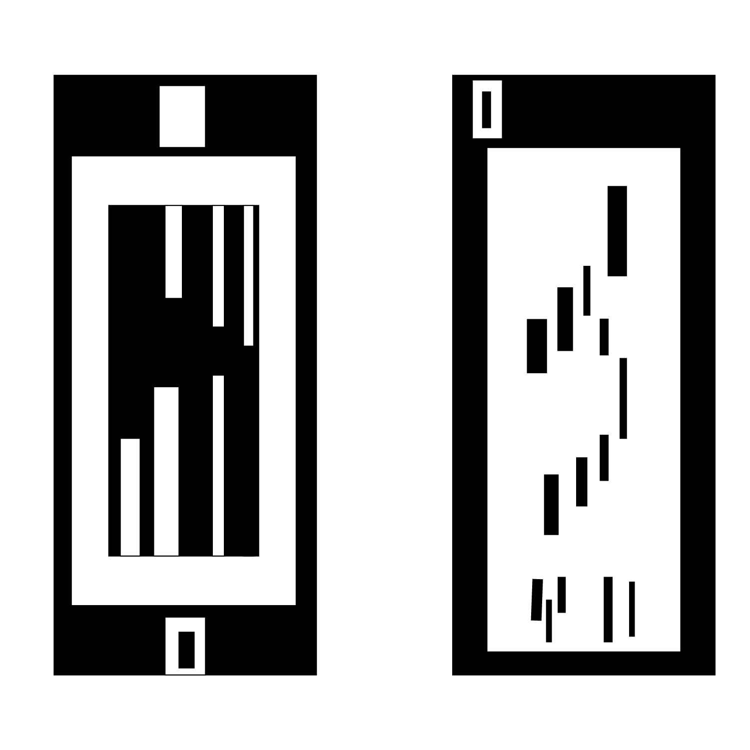
Taking vertical rectangles to create a design is the theme behind this project. Using vertical rectangles to create the front and back on a phone, for the font the phone is playing a flappy bird game with the game loading up, and for the back showing the camera and a simple design for a phone case
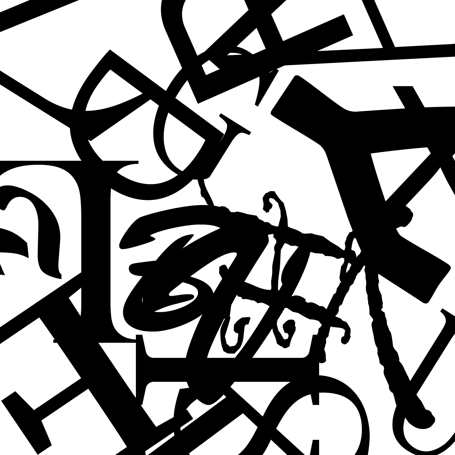
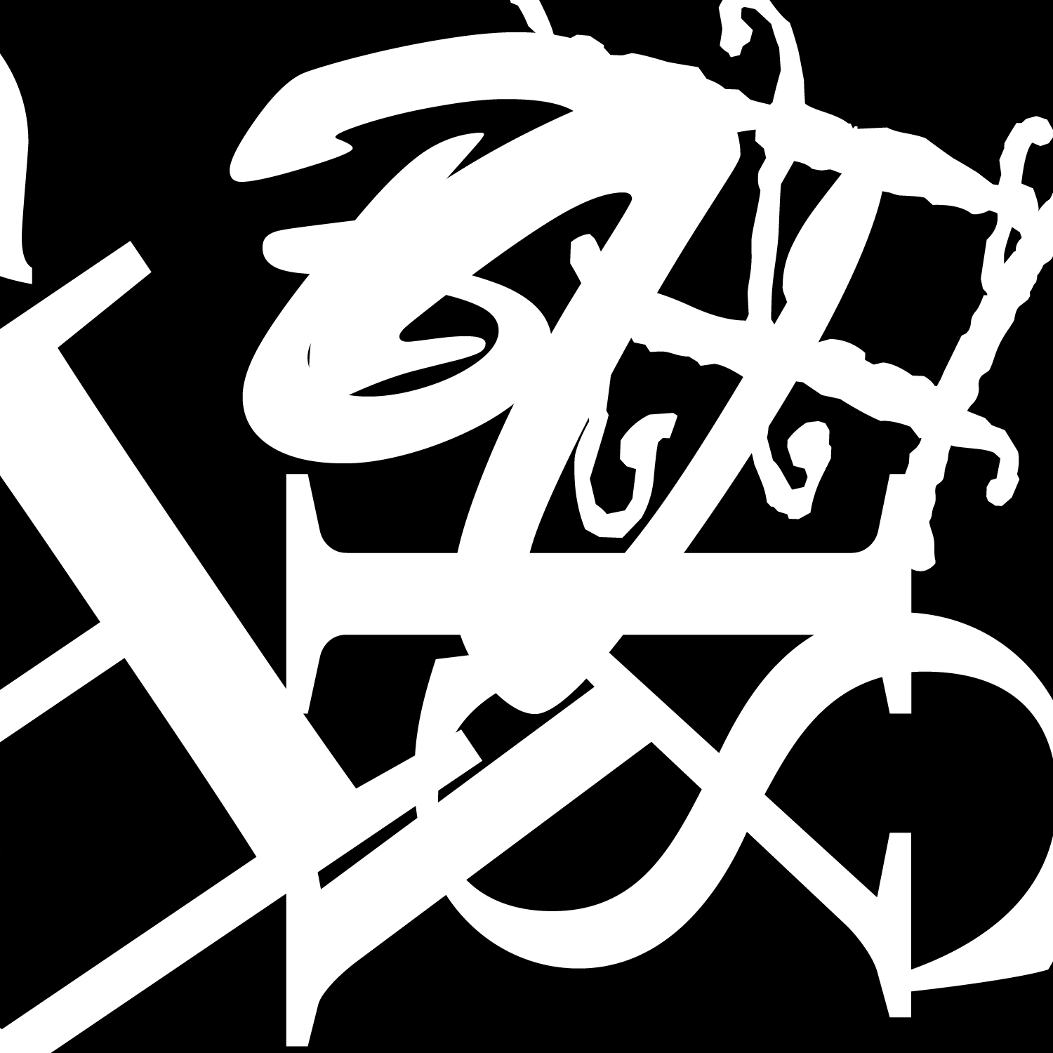
Similar to the previous design this has the same element, the design uses equal amounts of black and white to achieve the desired effect. With all letters and shapes should all overlap it creates a unique effect.
Taking different letters and making a figure that you can tell what the letter is but not the first glance, the black elements in the design have just as much visual impact as the white.