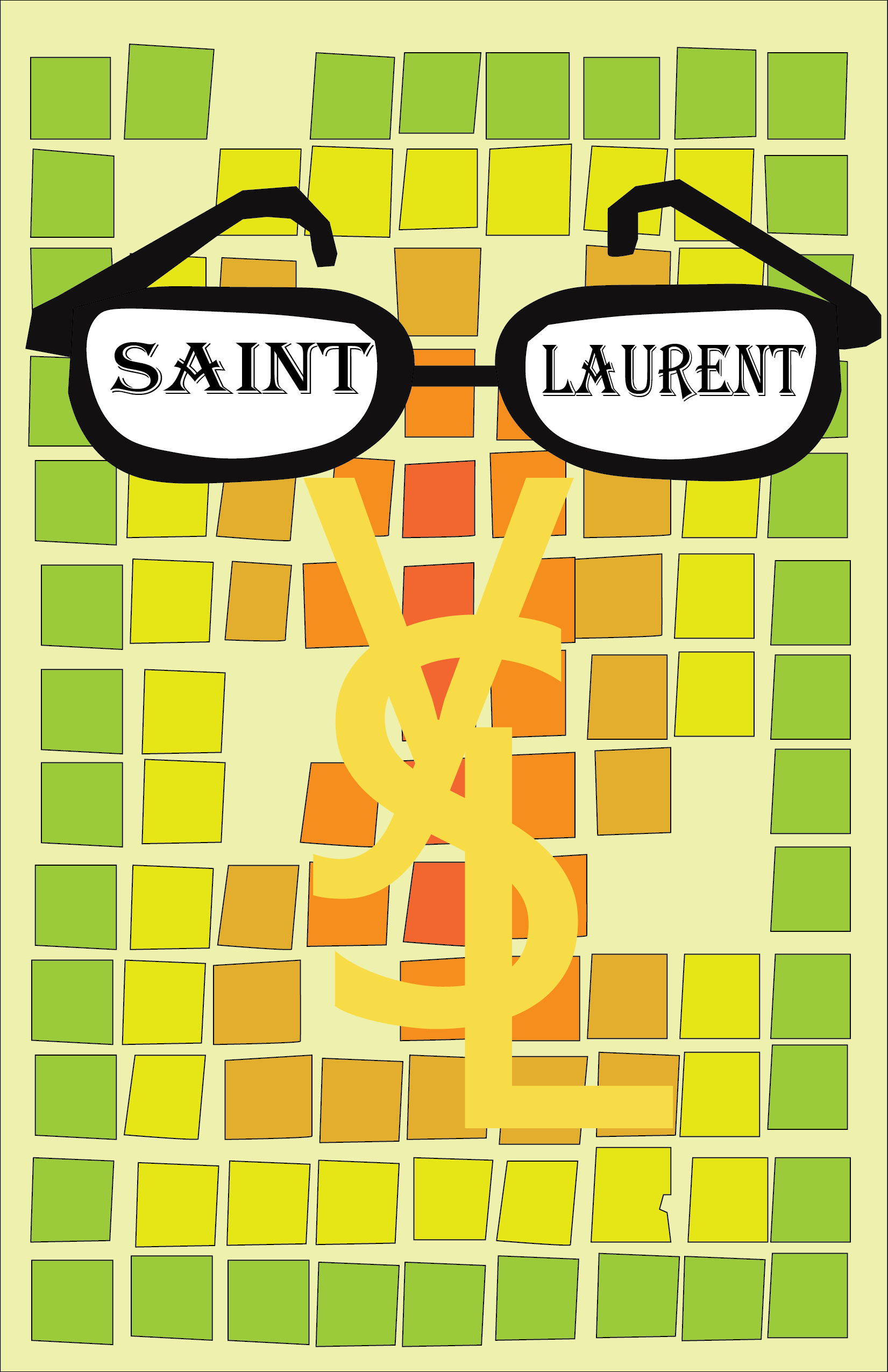
For the next three projects, they were finished on the same day, taking a similar idea using different themes with different colors in the color wheel. The theme for this project is Saint Laurent, taking the color from the cool color wheel to create the design around this.
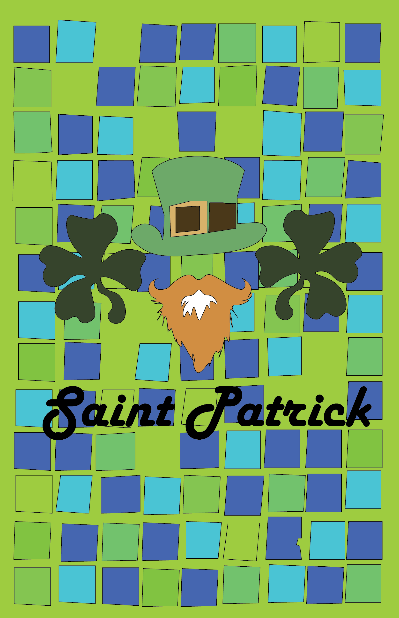
The next project here is base on Saint Patrick with similar aspects from the other two projects so using blue and green colors and using different saturation and hue to make the squares around the design.
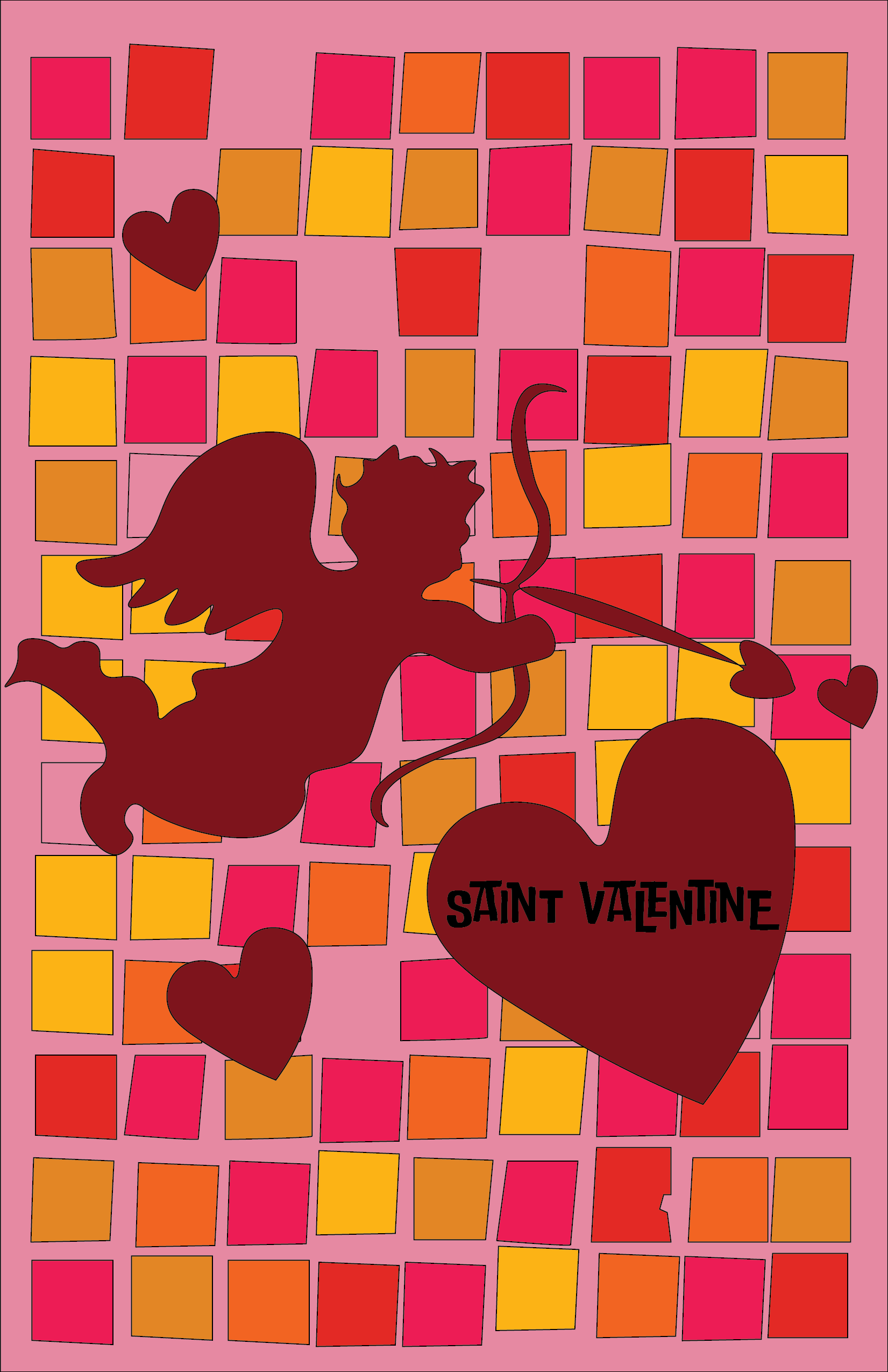
And for this project, the theme is Saint Valentine, unlike the other two poster designs I took the warm color to make the squares around the design with the whole heart and love theme for this poster. Overall the poster takes not only different colors but different color harmonies. The overall emotional content and tone of the three new posters are very different from each other.
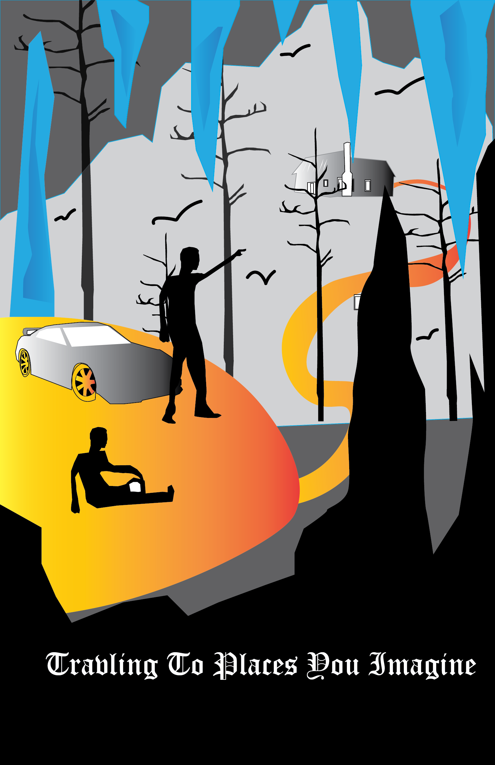
The theme behind this poster design is traveling, traveling to a fictional place. It can be a golden road to bright but instead, it leads towards a creepy house, same with the setting of the poster in a cave with ice but at the same time with rocks that are not frozen.
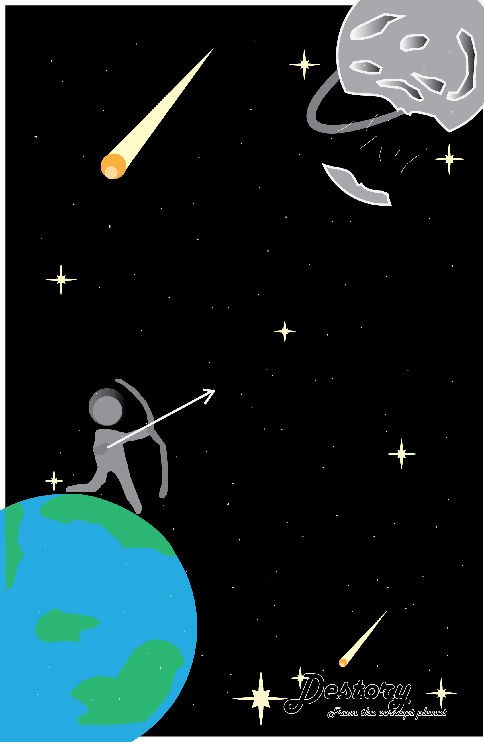
Taking JPL poster designs as an inspiration to create a poster. The story behind is a planet falling apart and the pieces are falling towards earth creating disaster and the astronaut's job is to take a bow and shot down the falling pieces from the corrupted planet.
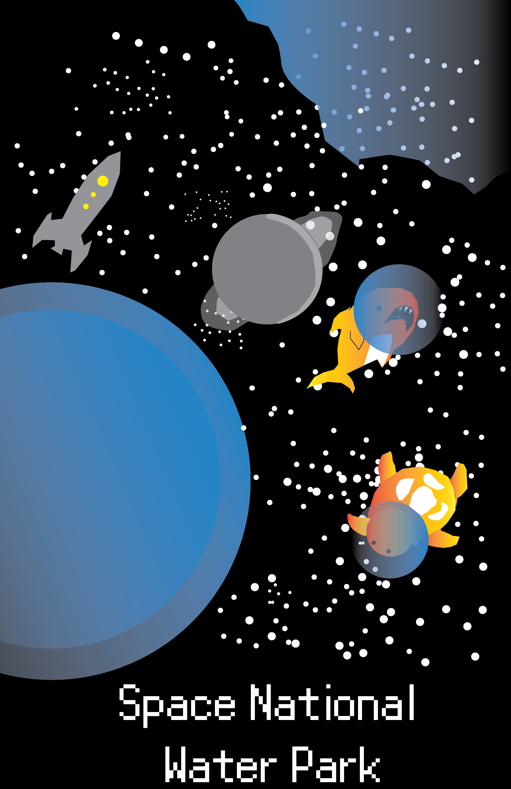
Have you ever vision what a park would look like in space? For this poster design, I create a vision that I have towards what I think a space national park would look like in space. For me water parks are more similar to space with zero gravity and are hard to control, this is why there are only water creatures in this poster.